Mobile navigation for service websites should help a visitor find the right explanation and continue toward an appropriate enquiry. A menu can look tidy in a design file while becoming difficult to use on a small screen. Long labels, unclear service groups and inconsistent behaviour often reveal decisions that were never resolved before development. This guide describes a practical review for a small or growing service website. It applies to teams in Istanbul and businesses serving customers in several markets. The aim is a navigation system that is understandable and maintainable, with proportionate interaction and performance checks. It does not require a new design library or a complete website rebuild.
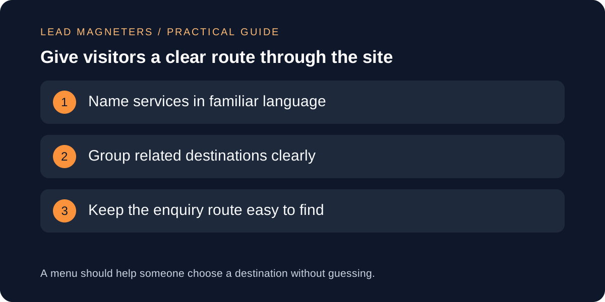
List the journeys the menu needs to support
Start with a few realistic tasks rather than a complete inventory of pages. A new visitor might want to understand one service, learn who provides it and find out how to start a conversation. An existing prospect may return to check a specific detail before sending requirements. Write these tasks as short questions and identify the current destination for each. If the website cannot answer a question yet, mark it as a content gap. Do not hide that gap behind a new menu label that promises a page with more information than it contains.
Review the tasks with someone who receives enquiries. Their observations can reveal language that customers actually use, especially when internal service names are unfamiliar outside the company. For a hypothetical agency, a visitor may recognise Website Development more readily than a branded package name. The package can still appear on its own page where it is explained. Keep the menu focused on selecting a useful destination. Detailed qualification questions, long service descriptions and the entire sales process generally belong in the page content rather than inside a crowded navigation panel.
Group services without making visitors learn your organisation
Create a simple page map showing the main destinations and their relationships. Group items because they help the customer compare related subjects, not because they belong to the same internal department. A service business might keep its core service overview, company information, practical guides and contact route clearly distinguishable. The exact structure depends on the site's content. There is no universal number of menu items that guarantees clarity. Test whether the proposed labels let someone predict where information will be found before asking them to judge the visual style.
Avoid using the same vague label for different destinations. If Overview appears several times, the surrounding context should make each one unmistakable. Keep important destinations reachable without opening several unexplained layers. Where a parent service page exists, decide how users reach it when the same menu group also contains child pages. Record that behaviour explicitly for the developer. A menu that opens on one tap and navigates on another can be confusing if the distinction is invisible. Clear link and control roles are more useful than a clever interaction that only its designer understands.
Review the interaction with more than a mouse
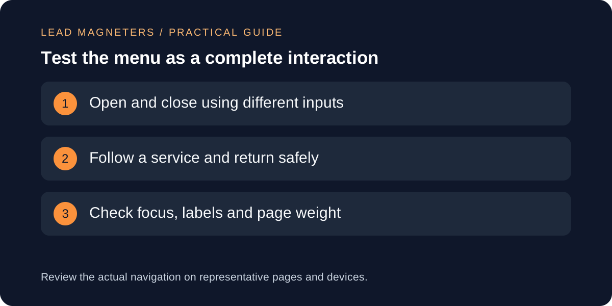
W3C's menus tutorial highlights structure, recognisable states and operation using different inputs. It explains why keyboard access and appropriately sized targets matter, and why dropdown behaviour needs care. Use this guidance as a starting point for an implementation review rather than assuming that a menu is accessible because it opens successfully with a mouse. The navigation's visible design and its underlying semantics need to work together. A separate, broader accessibility assessment may be needed if the organisation has specific conformance requirements.
Write an acceptance checklist around real actions: open the menu, reach a service, close the menu and continue reading. Ask the developer to demonstrate keyboard operation and explain where focus moves. Check that the current location and expanded state are understandable. Try longer page labels and a zoomed view, not only the shortest English wording at the default size. Record the device, browser and input used when reporting an issue. A precise observation such as the second service link becomes unreachable is easier to investigate than a general comment that the menu feels awkward.
Keep the small-screen layout calm and readable
Review the menu with the amount of content the live site will actually contain. A prototype with three short labels can hide problems that appear after translation or after more services are added. Check line wrapping, spacing and whether the visitor can still understand each group. Avoid using decorative images as the only way to distinguish destinations. If an icon carries meaning, make sure that meaning is also available in the label or another appropriate explanation. A menu should remain understandable when visual details are missed or when a visitor is scanning quickly.
Consider how the menu interacts with other fixed elements. A sticky header, consent notice and floating contact button can compete for limited space. Review the whole page rather than approving the menu in isolation. Check whether opening the navigation obscures the control needed to close it, or whether the page appears to move unexpectedly behind it. These are practical usability observations to test on the implementation, not assumptions that every overlay behaves badly. Prefer the simplest layout that supports the necessary destinations and works consistently across the site's main page types.
Protect performance and keep implementation proportionate
Tell the developer which interactions are necessary before choosing a component package. A basic service menu should not acquire a large dependency solely for an animation that does not help navigation. Ask what additional code, fonts or imagery the proposed change introduces and whether existing site components can support it. Compare the implemented page with the previous version under similar conditions. A menu is used across many pages, so an unnecessary addition can affect a large portion of the website even when the original design change appears small.
Keep links to ordinary pages as straightforward as the framework allows and maintain clear destinations in the rendered content. Test that navigation remains useful under slow loading conditions and that a failed decorative asset does not remove the route to a service. Do not claim a speed improvement solely from reducing one file if other changes were made at the same time. Save a small record of the before-and-after implementation and the checks performed. This helps future editors understand why the menu was kept simple and what should be rechecked when its behaviour changes.
Use a repeatable review before adding more destinations
Run the same short tasks on the homepage, a service page and an article. Navigation can behave differently when a page has a long title, a different header background or content that reaches a particular breakpoint. Follow each changed link and confirm that it opens the expected page without an unnecessary redirect. Review labels against the destination heading. When a page is retired, update the menu as part of the same change rather than relying on a redirect indefinitely. Keep ownership clear so that content and navigation do not drift apart.
Ask a person unfamiliar with the proposed structure to find a service and explain what they expect before opening it. Their interpretation can reveal ambiguity that the project team no longer notices. Record the observation and decide whether the label, grouping or destination needs work. For a website consultation, bring the current page map, the tasks visitors struggle with and any device-specific examples. That makes it easier to choose a focused improvement and retain a fast, understandable site as the business adds services, articles and new audiences over time.