An accessible contact form checklist helps a service business examine the moment when interest becomes an enquiry. The form may look simple, but visitors still need to understand each field, correct mistakes and know whether their message was received. A company serving Istanbul and overseas customers should also account for different names, phone formats, languages and devices. Adding more required fields is not always the best way to improve lead quality. This guide focuses on the interaction itself: labels, error recovery, keyboard use and submission feedback. It is a practical starting point for a review, not a claim that passing a short checklist establishes complete accessibility compliance.
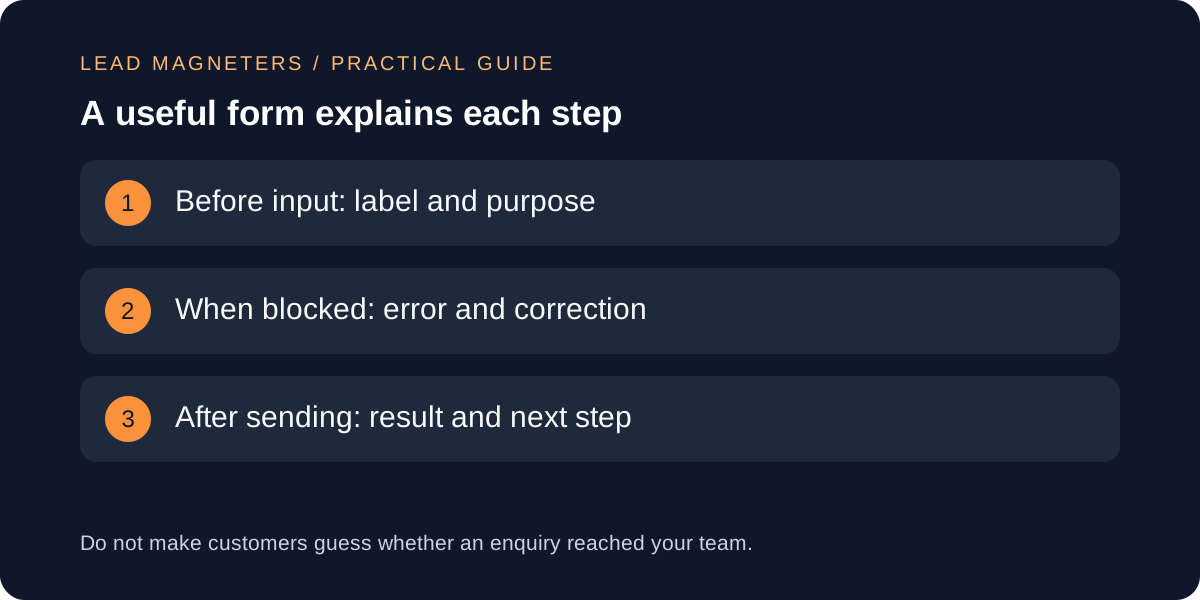
Ask only for information that serves the next step
List every field and write why your team needs it before the first reply. A name, an appropriate contact channel and a short description may be enough for an initial conversation, while a technical quotation can require more context. Separate information needed to respond from information that is merely convenient for later reporting. If a field has no clear purpose, reconsider it before making the visitor complete it. Explain unusual requirements beside the relevant control.
Review the form with the person who handles incoming enquiries. Ask which missing details actually prevent a useful response and which can be established during follow-up. This creates a better basis for qualification than adding budget, deadline and company-size questions by default. Make optional fields recognisable, and avoid asking visitors to repeat information they already supplied elsewhere in the same journey. For international audiences, check whether the form assumes a local address or phone pattern that does not apply to the customer.
Use visible labels and understandable instructions
W3C's forms guidance describes labels, grouping, instructions and feedback as core parts of an accessible form. Give each control a label that remains available while the person types, and ensure the implementation associates the label with the correct input. Placeholder text can provide an example, but it should not carry the entire explanation. Where several controls form one question, make that relationship clear in both the visual layout and the underlying structure.
Use the language customers understand. A label such as project details can be supported by a short prompt asking what they want to achieve, rather than technical vocabulary that assumes a developer is completing the form. Explain the expected format only when the system truly requires one. Test long labels and translated instructions on a narrow screen. Keep essential help near the field it supports instead of placing it in a separate document the visitor has to open and interpret before continuing.
Make errors specific and recoverable
When input is rejected, identify the affected field and explain how to fix the problem in text. W3C's notification guidance also discusses ways to help users locate errors and recognise successful completion. A red border alone is not enough information for everyone. Preserve valid entries where appropriate so that correcting one mistake does not require starting over. Check that the instructions describe the actual validation rule rather than a generic message that says only that something went wrong.
Prepare examples from the business's real audience. An international phone number, an accented name or a long company name should not be treated as obviously invalid merely because a simple pattern did not anticipate it. If the system rejects a particular format, decide whether the restriction is necessary and explain the accepted alternative. Test the correction process from the customer's perspective: after fixing the field, does the error clear, does the form retain the other details and can the person continue without confusion?
Prepare clearer interface copy →
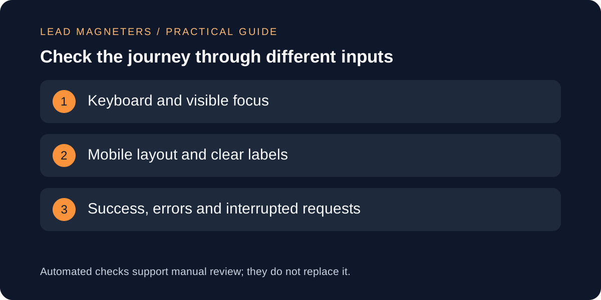
Check keyboard use and the mobile layout
Complete the form using a keyboard without relying on a mouse. Follow the order of focus, check that the current control is visible and confirm that every necessary action can be reached. Include optional disclosures, service selectors and any consent controls in the review. A custom dropdown that looks elegant can still be difficult to operate if its behaviour is inconsistent. Prefer familiar controls unless a custom interaction solves a genuine problem and has been carefully tested.
On a small screen, look for labels cut off by fixed widths, buttons hidden behind sticky elements and error messages that shift important controls unexpectedly. Check the page at increased text size as well as at the default view. Avoid making an essential instruction depend on hovering over an icon. If a diagram or example helps explain the request, keep it lightweight and ensure that the form is still understandable without seeing the image. Record concrete failures rather than relying on a general impression that the page feels usable.
Distinguish accepted submissions from clicks
Test what happens while a request is being sent and after the server responds. The interface should give a clear result, avoid accidental duplicate submissions and explain an unsuccessful attempt. A success message should follow the application's accepted submission state, not appear simply because the customer pressed a button. If the process includes email delivery or a CRM record, verify that operational path separately; the visible confirmation cannot establish every downstream outcome on its own.
Use authorised dummy enquiries and keep them separate from genuine customer records. Test a successful request, a validation failure, an interrupted connection and a repeated click. Decide what information can be safely retained during recovery and avoid exposing enquiry text in public URLs or analytics events. Make the confirmation practical: describe the next step accurately and provide a suitable contact alternative when appropriate. Do not promise a response time that the team has not agreed and cannot support across its working hours.
Keep accessibility checks in normal maintenance
Treat a form as a maintained part of the service, not a component that is finished after launch. Changes to validation, translations, spam controls or a third-party integration can alter the experience. Keep a short set of repeatable test cases and rerun the relevant ones when the journey changes. Automated tools can identify some issues, but manual keyboard checks and appropriate assistive-technology testing remain important. Escalate complex accessibility questions to a qualified reviewer instead of presenting a limited test as a complete certification.
Connect the review with lead handling. A clear form is only useful if someone receives the enquiry and takes responsibility for the next action. Give the web team a route for reporting failures and the sales team a way to flag recurring customer confusion. For a website development discussion, bring the live form, the required information, examples of errors and the current follow-up process. That creates a concrete improvement brief and keeps design, accessibility and operational reliability connected to the customer's actual task.