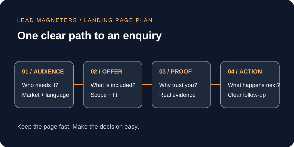
A Google Ads landing page should help a potential customer decide whether your service fits their needs and how to take the next step. For businesses in Turkey, that decision becomes more complex when campaigns also reach buyers in the United States or the Gulf. Visitors may arrive with different languages, working hours and expectations about delivery. Sending every click to a general homepage can leave those questions unanswered. This guide explains how to brief a focused landing page, preserve mobile speed and judge results using qualified enquiries. The examples are planning scenarios, not client results or promised conversion improvements. Start with one service and one audience, then expand only when your team can support the additional demand.
1. Write a Google Ads landing page brief before designing
Put five decisions into a short brief: the service being promoted, the customer it serves, the problem being solved, the evidence available and the next action. A company offering website development might choose established Istanbul businesses that need a faster enquiry website. Its page should explain that specific project, rather than opening with an unrelated catalogue of branding, social media and recruitment services. This makes the page easier to write and gives the advertising team a clear destination for relevant searches.
Map the promise in the ad to the opening heading and the offer beside the enquiry button. If the ad invites a website assessment, the page should explain what that assessment includes and what information is required. Avoid promising an instant quotation when a specialist must first review the project. Name the person or team responsible for following up, agree a realistic response window internally and publish only a commitment the business can meet. These operating decisions matter as much as the layout.
2. Separate geography, language and buying context
An English-speaking buyer in Dubai and a Turkish-speaking buyer in Istanbul may need the same service but different information before contacting you. Choose the page language from the audience and actual sales capability. Do not assume every Gulf prospect wants Arabic or every international prospect wants English. Where you have demand and qualified language support, prepare a properly reviewed version with its own clear URL. Translating a button while leaving the service details in another language creates an unfinished experience.
Google Ads location settings distinguish people likely to be in or regularly in an area from people who also show interest in that area. Google says these signals are not perfectly accurate. Check the campaign setting against the brief: a local appointment business and a Turkish exporter seeking overseas buyers have different needs. Neither setting is universally correct. Review actual enquiry locations alongside campaign reports before deciding that an unexpected lead means the page itself is failing.
For a US buyer comparing a Turkish agency, explain meeting availability, project communication and delivery responsibilities. For a Gulf company, clarify which market the campaign will serve and who will review local messaging. Treat these as specific buyer questions, not assumptions about national behaviour. Keep separate pages only when they answer meaningfully different questions; copying the same page and replacing a city name adds maintenance without improving the offer.
3. Make the offer and navigation easy to understand
Google has explained that relevant content and useful navigation both matter to the experience after a Search ad click. A focused landing page should still let visitors find the information they need. Give people an obvious path to the service details, the company behind the offer and contact information. A visitor checking whether your business is credible should not have to return to search because every navigation option was removed.
A practical page order is a clear promise, a short explanation of who the service suits, the work included, evidence, common questions and an enquiry action. Use a sample deliverable or an accurate description of your process when permission to publish client work is unavailable. Do not replace missing evidence with invented testimonials, partner badges or revenue figures. If price depends on scope, explain the factors that change it, such as number of markets, content requirements and integrations. You can be useful without publishing a misleading fixed price.
Give the primary button an action-specific label such as Request a website assessment. Explain whether clicking opens a form, starts a call or launches a messaging app. Repeat that action after the main information so readers do not need to scroll back to the top. Keep secondary links readable and available, but avoid presenting several unrelated offers with equal visual emphasis.
4. Protect mobile speed while keeping useful content
Begin with a page that works as readable text, ordinary links and a reliable form. Add visual elements when they explain the offer. A small diagram showing the delivery process can be more useful than an autoplay background video. Reserve space for images so content does not move as they load. Keep the main offer visible without waiting for a carousel, animation or external chat widget. Review every added script with a simple question: what necessary customer task does it enable?
Core Web Vitals cover loading, responsiveness and visual stability through LCP, INP and CLS. Google's web.dev guidance defines good thresholds as LCP at or below 2.5 seconds, INP at or below 200 milliseconds and CLS at or below 0.1, assessed at the 75th percentile of visits. A laboratory test is useful for finding problems, but it does not replace real visitor data. New or low-traffic pages may have no field report yet. Record the testing conditions rather than treating one performance score as a permanent guarantee.
Test on a narrow screen and a slower connection before approving the design. Can someone read the offer, open the menu and complete the form without zooming or losing their place? Check the page again after analytics or a scheduling tool is installed; an initially fast design can become heavier through later additions. Assign an owner to those additions so performance remains part of routine maintenance rather than a one-time launch exercise.
Source: Google web.dev: Web Vitals.
5. Measure enquiries that the business can serve
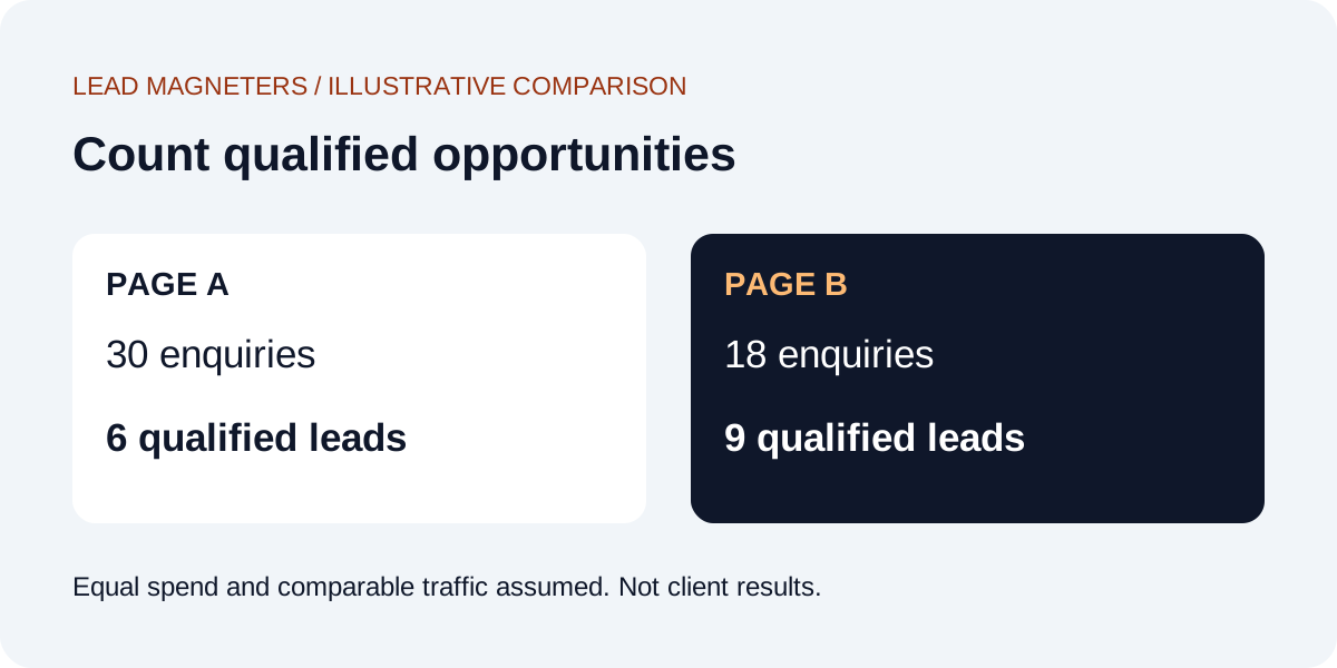
Define a qualified enquiry before comparing landing pages. For example, your team might require a relevant service need, a supported market and usable contact details. A button click alone does not establish any of those things. Keep reporting stages separate: a visitor started the form, the server accepted the enquiry, a team member qualified it and a sale was agreed. Document what each event means so a dashboard does not accidentally count several actions from one prospect as several new customers.
Use an illustrative comparison to check your priorities. Page A produces 30 enquiries and six are qualified; page B produces 18 enquiries and nine are qualified. If both used the same advertising spend and comparable traffic, page B has the lower cost per qualified enquiry, even though page A has more form submissions. This is not a forecast. It shows why your decision needs information from sales as well as an advertising dashboard. Also review eventual revenue and the time required to serve each customer.
Ask only for information needed to respond or route the enquiry. Use visible field labels, specific error messages and a clear confirmation after successful submission. Have the team test delivery to the actual destination mailbox before launching ads. A polished form that silently loses requests is a more urgent problem than a small difference in button colour. Keep sensitive details out of analytics URLs and involve the appropriate privacy specialist when defining consent and data-handling requirements.
Discuss campaign measurement and planning →
6. Launch one useful page, then improve it deliberately
Before launch, read the ad and page together, check every important link, submit a labelled test enquiry and confirm that someone receives it. Check the phone number, supported languages and published response expectations. Ask a colleague unfamiliar with the project to explain the offer after reading the opening screen. If they describe something different from the service you intend to sell, clarify the copy before buying more traffic. Save the approved page version and record the campaign destination so later edits remain traceable.
After launch, group feedback into targeting, message, usability and follow-up problems. Change the part supported by evidence instead of redesigning everything at once. If you have enough comparable traffic, define an experiment and success measure in advance; if volumes are small, start with clear defects and repeated customer questions. A fast, understandable page with honest information gives your campaign a sound starting point. Bring your audience, current page and sales process to Lead Magneters to discuss a focused improvement plan through our existing advertising, website and consultation services.